Thursday, April 23, 2026

ESCAPE-ELM GROVE AND THE MILKY WAY

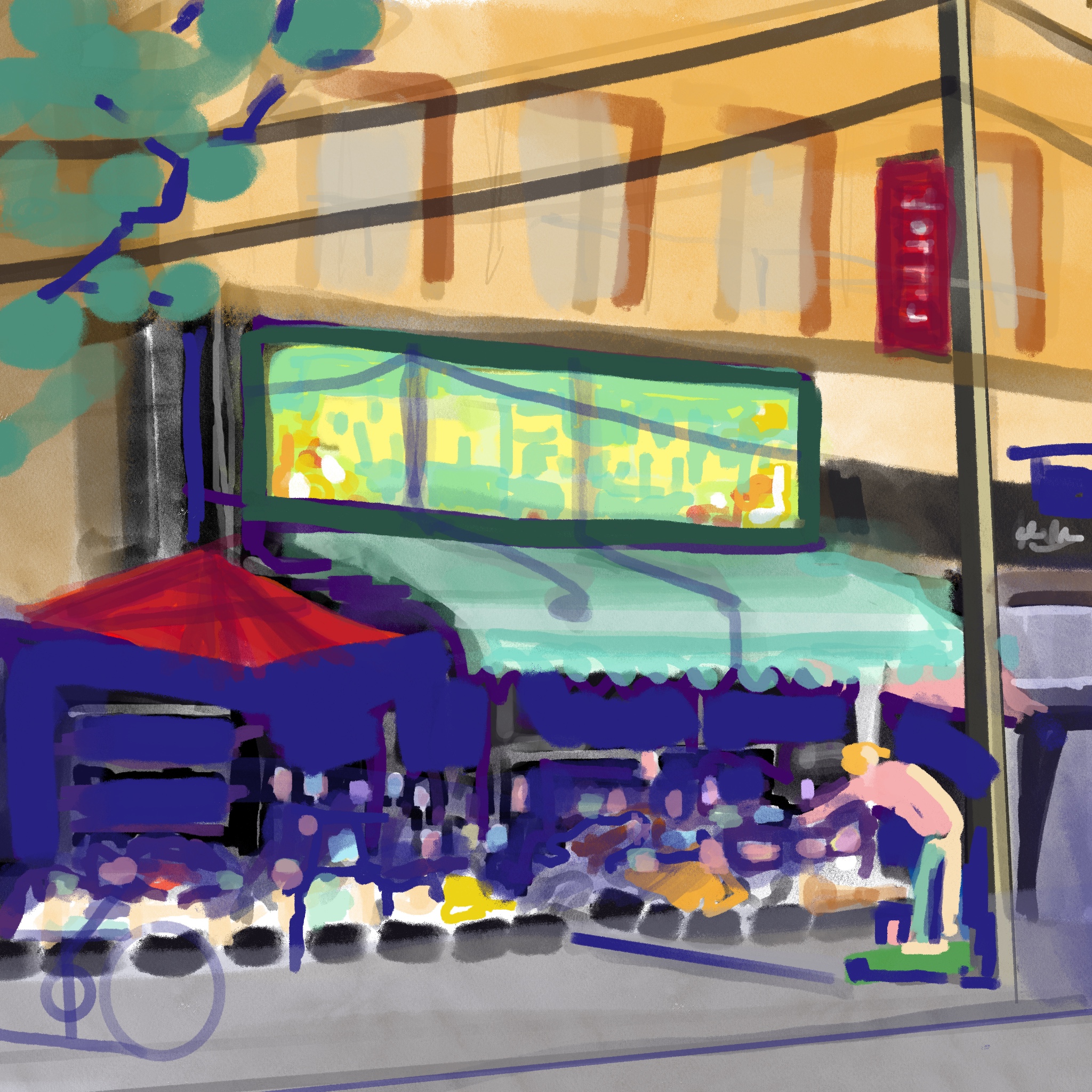
 iPad Procreate aids in sorting out a colour strategy, as well as cropping the sketch, adding distortions, and trying out squirrel v.s. sparrows as punctuation.


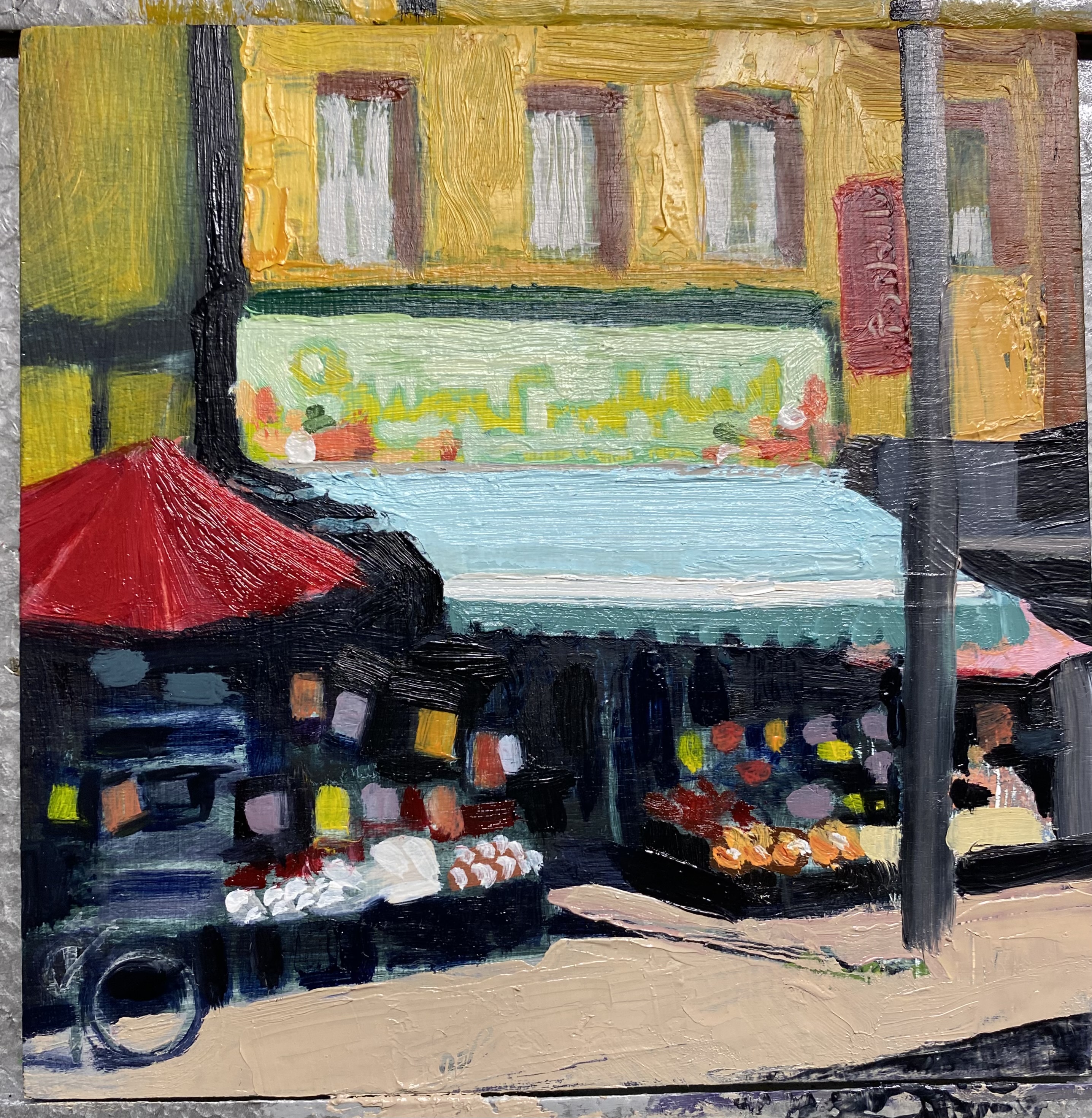
I worked on this composition over a year ago. After reducing my colours to 2 or 3, a split complimentary group of yellow, teal, and violet seems to work, to get the transparency in the shadows and the glimmer in the highlights. Exaggerating the angles of vertical posts to a four-dimensional distortion makes the sky a more interesting shape and the space inside the balcony more angular and more interesting. The pink underpainting will contrast well with the teal.


Thursday, February 19, 2026

More Gouache Thumbnails

 I have had a larger canvas in mind for a while now- I captured a night photo of a cleaners in the east end. the colourful signs and other lights against dark warm and cool neutrals should do it. I have a sketch on iPad, along with some colour notes as shown here.


I have spent an hour doing gouache studies now that I have a colour palette worked out. I am experimenting with a dark blue ground - like a Prussian - and a muted orange ground. Underpainting is often complimentary but in a nocturnal I have no experience.
The larger watercolour to the right is a Nathan Foukes exercise, which dries much more slowly because of the washes. Two gouache studies at once is effective as time spent  remixing colours is reduced.

Friday, October 17, 2025

Gouache THUMBNAILS


 Nathan Fowkes book is so inspiring! Twenty minutes or an hour on a small study, with three considerations:
-grab that inspired momentary reason for choosing it-BIG SIMPLE RELATIONSHIPS
- squint, find the values- VALUE STATEMENT

A  exercise: Standing on the Shoulders of Giants. Take a large sheet, grid it off with tape and create small values studies based on painters and paintings you admire. I’m starting with his book lol


Friday, October 10, 2025

Scale-Up? How much?


Often I hear people say I should work larger. This tiny 6x6  oil painting is intimate and inviting in my hallway.
Hanging in a small space it is intimate and inviting, so seeing it mocked up on a 40 inch scale is somewhat disconcerting.Does the subject still work?
Exhibited at Leslie Grove Gallery, it didn’t seem to receive the attention that the larger works did.


Monday, September 22, 2025

Finishing Touches


 This small grocery is a locus for locals- we wade through traffic to meet there. Getting there early in the morning shows off the warm buff coloured brick and the shadows on the awning. The small 6x6 inch seems to suit the subject- a tiny but bountiful and fresh selection, tucked into an inviting storefront display.

This little oil painting goes to Leslie Grove Gallery tomorrow for the Crossings show!

Tuesday, May 27, 2025

What a difference a sky makes

Praça Do Município, Ponta Delgada Azores, Before the Procession, Sao Miguel


The darker underside of these clouds somehow doesn’t look right. Perhaps the lower edge needs to be softened?


Thursday, October 10, 2024

Too many colours?

 I was very excited about this small painting when I finished ragging out the light values from the Prussian umber underpainting, The more it progressed however, the more it looked like the photo, with too much attention to local colour and a pointlessness in strategy. Originally, it was the light dark contrast, the secret invitation to the interior where all good things are.

Orange, green and purple dominate, so secondary triad would be my guess. Would it be better in a more narrow range?
Cooler greens and greys and a blue violet shadow, and reds changed to maroon


Nearly done- the awning needs a darker green at the crease, the sidewalk and figure will go in, and the power lines and shadows, and a highlight on the pole.
Perhaps the signs under the canopy could be more muted.