Thursday, March 25, 2021

Portrait of Dad

 Mom saw a photo of a painting on a pillow and sent me a photo of Dad asking me to try painting it. She wants it to hug when she misses him. 

I envision something very loose, in watercolour, because there is not a lot of clarity in this photo.Also there is the question of this odd gesture of his- so typical!

 “You.... you.....” like De Niro in Analyse This!

Anyway, the notion I had was something I’ve been looking for online, with other artists and how they handle portraits. Some of them look inaccurate. Some look accurate but the messiness is contrived. I love those watercolour artists who know how to let the medium express the colour and paint quality with spontaneity while somehow keeping the resemblance intact, just enough.

Here’s one I love- https://youtu.be/_5VDv0Er74A

Agnes Cecile- great drawing, luscious watercolour in spontaneous washes and transparency, captivating a mood in the subject that makes me look longer.


Here is my cropped  photo
My workspace setup


My sketch and first wash.


His hand is still unfinished, as well as the highlights on his glasses. I deepened the browns of the hat. 


 Sorauren Park 

Our family took a walk to appreciate fine weather- without social isolation would we have been here? I sketched quickly with an interest in the relative size of figures in the frame. 

Holding the sketchbook up at eye level I tries to establish relative size, spacing, orientation on the page... making little reference marks in the margin. How do artist do this? Sarah Burns gets it to fit like a snapshot

https://youtu.be/vO4pRoBJFsM

My photo wasn’t taken at eye level. I took it in a hurry because we were continuing our walk. The spacing therefore is different than the photo because of that. Little stuff, but hey- trying to get better at the whole thing, so, the devil is in the details as they say.


I look at it after the fact, then I think, what a horrific mess. 

Later I think, maybe its not so bad after all.

Friday, March 19, 2021

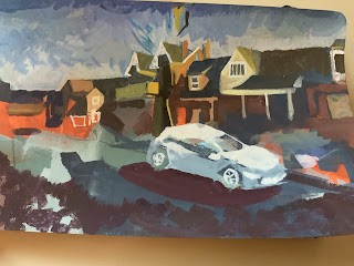
Practicing on a weird format

 I was given field sketchbooks that are 5 by 8 inches, which must fit well in a pocket (if I had one). Using this format when I was drawing outside or in waiting rooms and such places, I found the format kind of odd. The height of portrait mode lets you get closer to a subject, and this more horizontal format encourages a more panoramic view- incorporating larger amounts of information and making it hard to decide on a point of interest or focal point.

 Out in open air cafes, I produced lightweight pencil lines with unbalanced, indecisive compositions that I felt uninspired to finish or adapt to any purpose later!


I shot a panorama and attempted to draw it out roughly as underpainting. This was done with acrylic gouache, which I had not used before. As it turns out, the colours were far to concentrated and intense, and it would have worked better ragged on thinly with a more precise drawing on top. Precise but NOT DETAILED.

Kind of a mess. Since gouache is opaque, I should be able to correct this in subsequent layers.

I used the iPad to capture line positioning in spots critical to cramming it all in perspective.

The colours dry so darker than when mixed. I can also see where limited palette would be better. Getting the sun to shine is challenging.


Saturday, March 13, 2021

The Rest and research Phase

 Recharging batteries is important. Some things I do are good for me- morning meditation tacked on to when I rise in the morning. A daily walk. Some things I do are not, such as being lazy, watching TV and being scattered and unorganized. Researching a painter who sells online called Lori Mirabelli was so insightful, particularly with regard to instagram. She stresses having a body of work ready. Here, space is limited so keeping it small and doing works on paper helps, but I think I need to work on larger canvases, preferably at the same time as the small stuff. I waste too much time online, between household matters and art interests. More drawing and painting! Less browsing!

The past year I established a website, organized my materials and workspace, set up an Instagram account, and an Etsy shop,  created this Blog and an inventory of work for sale, and sold some paintings. Those goals were what I set out to do with a grief therapist after my Dad passed in 2018. Looks impressive when I spell it out this way. Now I want to carry this forward with more outdoor painting, Large Canvases in oil and when I have a bakers dozen or even half a dozen large canvases  I will join an artist run space, locally, and pay membership. that way the work will get hung at least once.

I also have learned a vector software, which would lend itself to selling downloads and wearable art. I also plan to make more small stuff like bookmarks and colouring pages for sales and givaways. Browsing while sketching and taking notes is a practical approach- see below.

sketchbook_browsingnotes1


Thursday, March 4, 2021

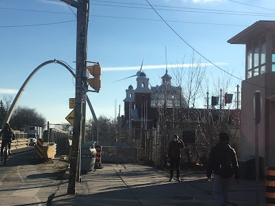
The Dufferin Gate


Arts and Crafts building -Dufferin Gate.  Field sketchbook, Gouache

 This was once a lovely place, especially in spring and summer when planting was done and life returned to the outdoors. Dufferin St ends here, and the Canadian National Exhibition grounds begin (kind of a giant fairgrounds, if Toronto was a small town). Walking and biking was a pleasure here once. Sometimes I look around me and am shocked by the chaos and inhospitable nature of our pedestrian environment. We are not known for city planning here, and change is occurring at a furious pace now. Even here though, my eyes and mind seek out something beautiful in how the sun strikes it. I came to take a photo of the glass dome in the late afternoon because the eccentric shape of the former Arts and Crafts Building (you can tell my age, now) against the sky helps get my compositions away from the squares and rectangles. We wonder if the grand old fair will commence  next summer, after economic pressures, public health uncertainties and the rough urgency of new urban development deals come to bear. 

This is nearly finished. There are some aspects of "see-through" in the glass I wish I had paid more attention to. I'm gradually using these awful paints up and am ordering some from a supply store up north in Ontario. I've found some of those hard to get things there at good prices, and will once again avoid AMAZINGAMAZON.

What’s so different about gouache is the mistakes are adjustable, which flies in the face of my college colour theory experiments where streaks were avoided and flat level swatches were demanded. We all complained bitterly about the paint without ever trying a better quality product or working with texture, detail and layered colour!

DufferinGate_Arts and Crafts Building, Gouache