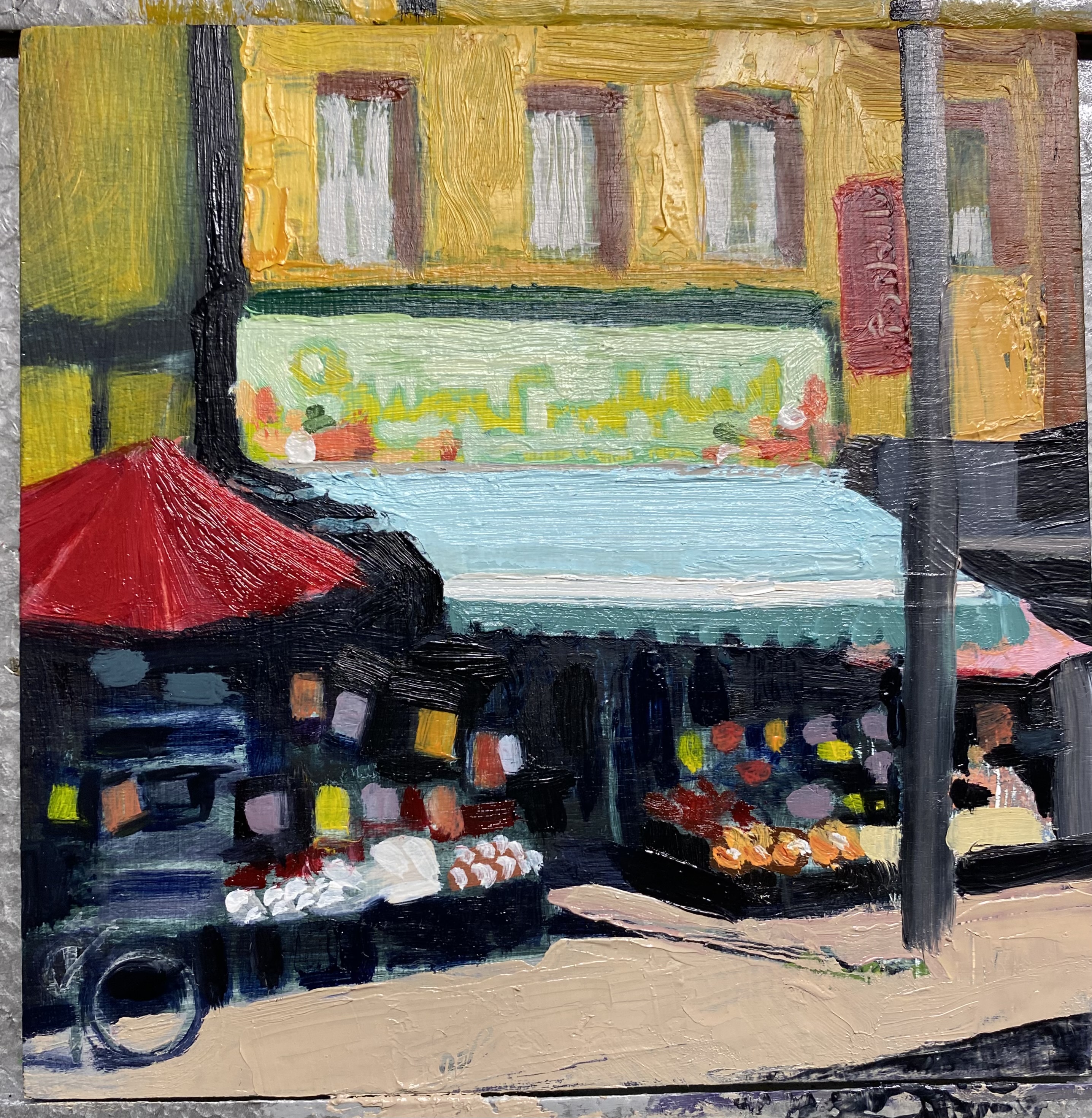
I was very excited about this small painting when I finished ragging out the light values from the Prussian umber underpainting, The more it progressed however, the more it looked like the photo, with too much attention to local colour and a pointlessness in strategy. Originally, it was the light dark contrast, the secret invitation to the interior where all good things are.
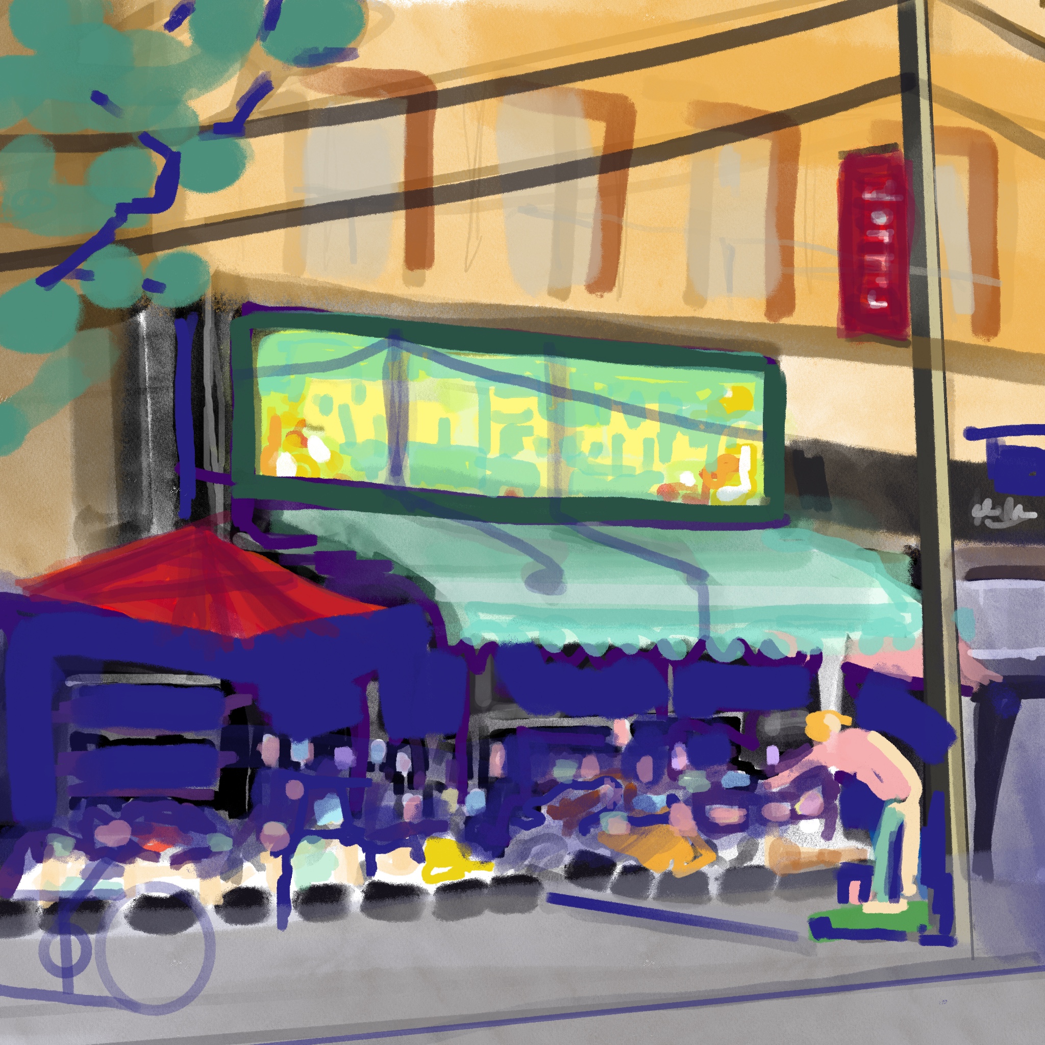
 | | Orange, green and purple dominate, so secondary triad would be my guess. Would it be better in a more narrow range? |
|
 |
| Cooler greens and greys and a blue violet shadow, and reds changed to maroon |
 |
Nearly done- the awning needs a darker green at the crease, the sidewalk and figure will go in, and the power lines and shadows, and a highlight on the pole.
Perhaps the signs under the canopy could be more muted. |