Thursday, July 28, 2022

The Buzzing Tree

 Walking the neighbourhoods near me is a regular thing now, with no gym membership. My daughter and I usually walk together and choose different destinations. For a change we went up to Beaconsfield, where there are curvy streets and cul-de-sacs. At one point we heard a strange and quite loud buzzing noise like machinery of some kind. Curious, we followed the sound to another street and a glorious old tree in full blossom. It was completely full of bees, furiously working on the nectar. So many bees, and so loud!

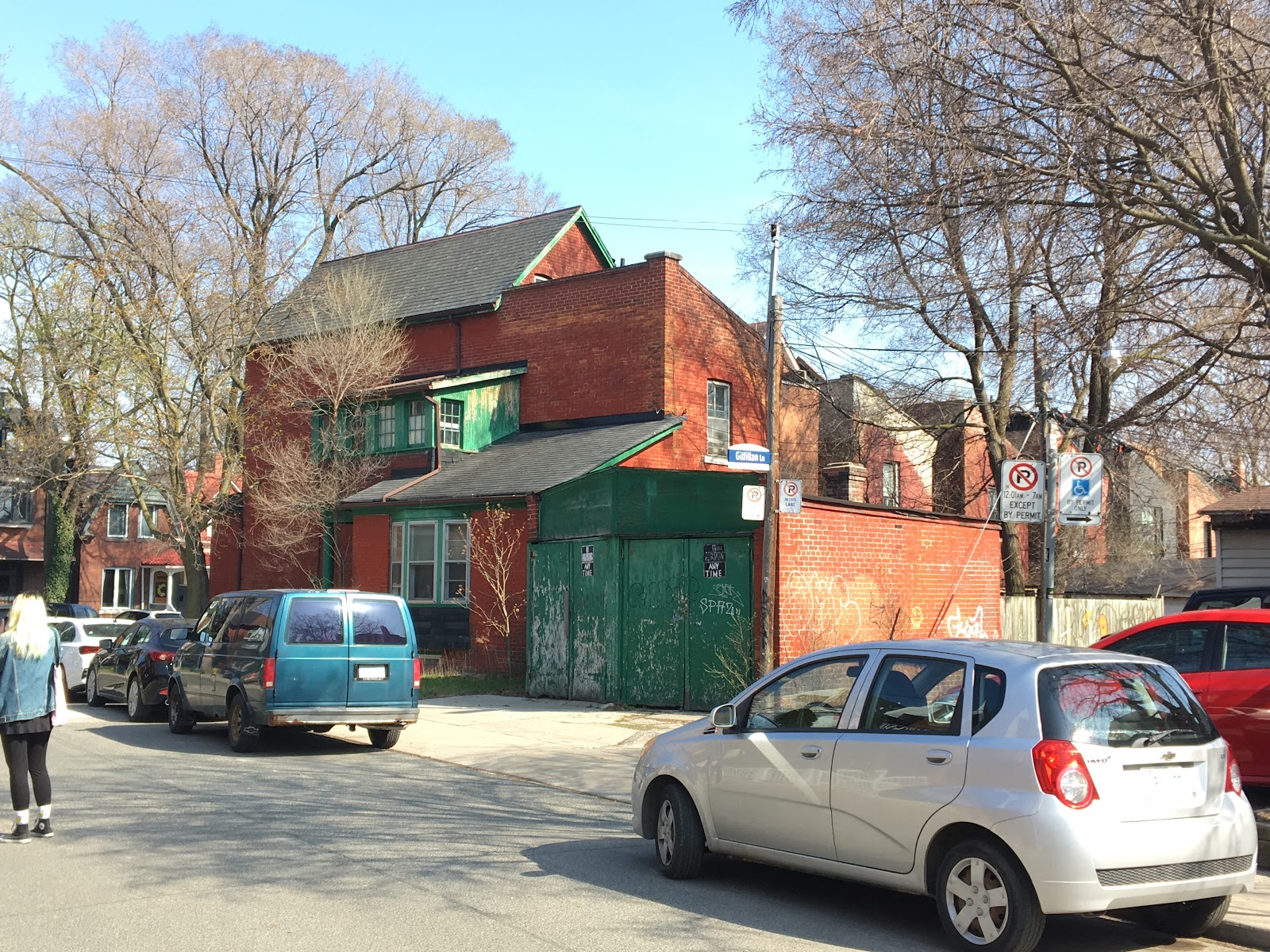
 I photographed the house across from the tree and later painted it. It has complimentary orange and pthalo in the sunlight with lots of planar shifts from one section to the next when viewed from behind. The lessons from my last entry about underpainting prompted a little experiment in colour and a more detailed underpaint. The bricks are under painted in light and dark blue while the sky is orange, with neutrals on the pavement and roofs. This is a cheap paper panel.



Tuesday, July 26, 2022

“Roll Out”


 Ok I’m actually liking these more than “Berry Box” which is exciting in the light of discovering an older failed attempt lingering in my kit. Granted it is unfinished but still… The colours were adversely affected by an umber under painting and the whole thing looks dead instead of Fresh.


Purple Penumbra

 Completed corrections on his panel! The wood has a nice textural effect on the Berrybox, and dry brush softened transition between light and dark blues and yellows. The penumbra has a lavender edge against the background.

Outlier - Acrylic on birch panel, 8x8


Monday, July 18, 2022

Corrections

Small adjustments to the shadow and background colour makes these look as brilliant as the first “Strawberry Box” did. I actually prefer the more decisive brush strokes instead of the lighter more tentative approach. In “Oddly Chopped Lemons” the shadow already had alizarin inside, but more seems to give depth. Intense sun made this a difficult painting from the beginning. The middle painting I may title “Roll Out”. The penumbra was violet, but I added a transitional lavender against the background yellows. That blue see-through is much better with the same lavender. The topmost painting, “ Outlier”, now has the same lavender transition in the penumbra of each shadow. The background needs ombré lighting in the light to darker blue range, all lighter than the tabletop. These changes were made with Procreate on my iPad!! It’s possible to make the changes in paint with much greater confidence and less mess,  waste and time. I do love this device and how it improves my tasks.
 

Thursday, July 14, 2022

More strawberries


 This painting is the one I cannot sell- my daughter says so! 

Yesterday I started a similar arrangement in acrylic- process photos follow-


The bright green leaves still have to be added. My daughter says they look like plums!


Acrylic paints dry out so fast outdoors. Still, I may try again with acrylic and mix only a limited range of colours at any given time, rather than laying out the full palette.

That meant stating by blocking in dark areas with  a raw umber/ phthalo blue. Then a purple penumbra around the cast shadow. The reds needed light and dark reds in varied temperatures. Painting with as few strokes as I can manage.It is a Triassic colour scheme with primaries.


Here is my setup with finished paintings from yesterday and today. I love my home made pochade box!


I see distortion in the boxes and can adjust the blue showing through the corner to fit more with the background colour. Hey, not a bad day!


Thursday, April 28, 2022

Callas

 This got entirely stalled whilst I scribbled with pen and ink. There is always some fear holding me back, and daily prompts from pen and ink challenge have helped a little. I did get a pen repaired and have fallen into daily use with it, as it is such a joy to draw line with.

The background colours were a little too dark, in retrospect. Still, carving shapes out has been somewhat successful. I love the image unfinished, and this is making me stall. I don’t understand why I worry so about blowing the job, since things do, for the most part, turn out! 

I am also documenting process with video on this one. It will generate a story on Instagram.

The soaked paper was used wet with flowing colour dropped in.


The colours were mapped out on a strip to help me recall them; Lemon Yellow, Pthalo Blue, and Transparent Iron Oxide which is used below to carve out the yellow blooms.


Monday, April 18, 2022

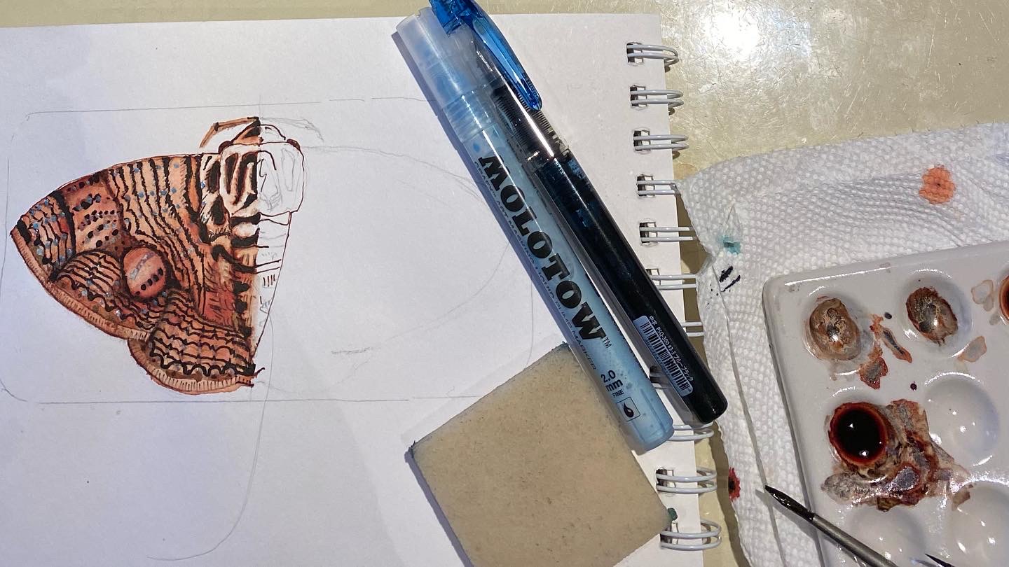
Moth-headed

 We all got Covid at my house! I can draw and paint but for some reason anything practical I do is overwhelming. Daily drawing lately has been an anchor in these strange times. The prompts this spring are all earth-related. It’s a great way to fill a sketchbook, and I won a prize from a Pen-focused Instagram Contest!

I find the idea pops into my head, and sometimes then I do a bit of research. I can credit other Instagrammers for their inspired photography, and challenge myself to push my comfort zone with media and techniques, and composition. The original inspiration nearly always sees me through, which is encouraging. These are posted, so they actually get COMPLETED, which I often have a problem with. I try to limit the pencil and fussiness, finding the best means to the end. I try to economize clean, confident  line and simplified colour palette. The only stage I don’t enjoy is the procrastinating!

Today the prompt was “moths”, and I got Procreate to give me the symmetry and background. The result is a digital file. Should I print the result and glue it into the sketchbook? Maybe. I’d like more commentary in imy sketchbooks too, like Liz Steel. My skills in Procreate are pretty rusty.


All in Noodlers Walnut with just a touch of black.

Vintage Nurses Pen from Fifteenpens


Background studies