Tuesday, November 26, 2019

Continuing the Quest for Likeness

O, wad some Power the giftie gie us. To see oursels as others see us! It wad frae monie a blunder free us, An' foolish notion.” Robert Burns

Mind you... I'd like to test the free money theory. 
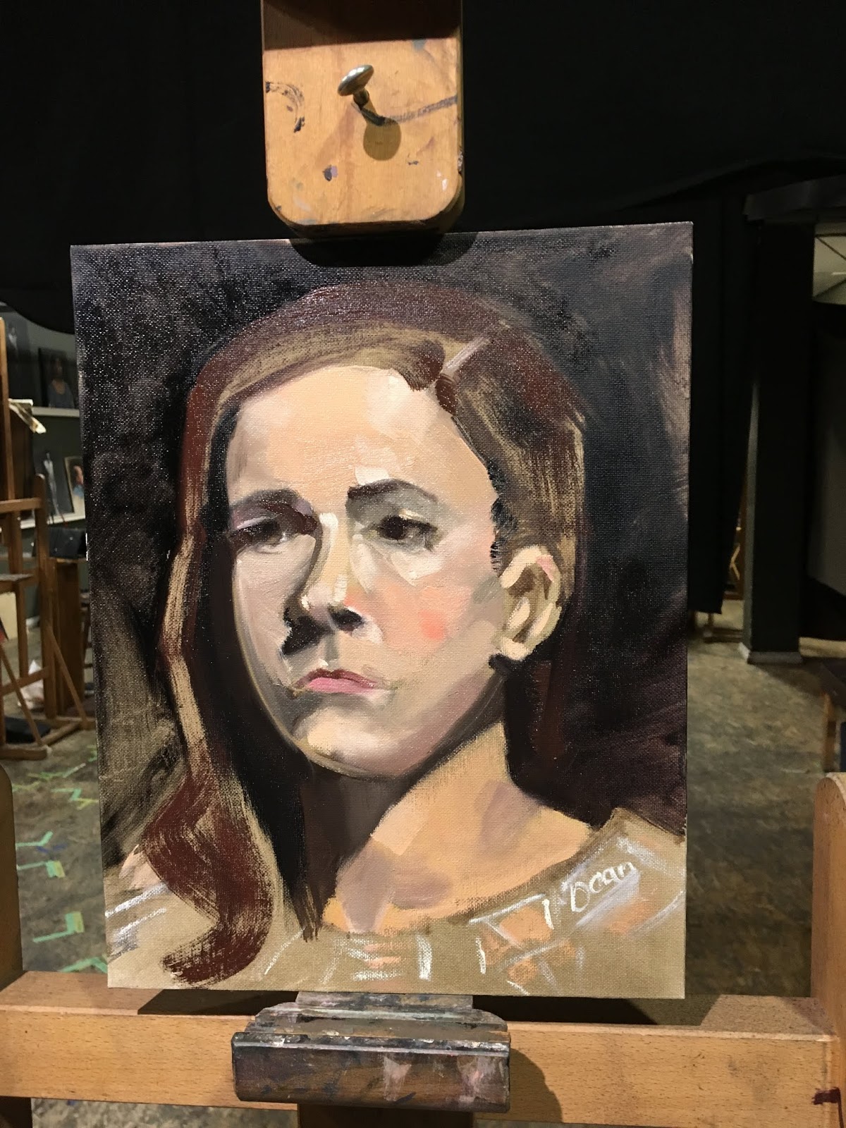
Ileen and I were practicing at her house with our easels set up in the living room. Lighting was weaker than I would have liked, as is the case with most of my photos intended for the purpose. All Prima forces economy because the time is limited. An hour or two and you are finished, although adjustments could be made later if desired. The portrait takes on a likeness that is imperfect but has a life of its own. I seldom adjust them later. However, I am not satisfied with the result either! The source photo was posed for me to take, feigning the activity, and was not the same expression. There are too many harsh dark cheek and brow values on the right, because they were reserved underpainting. As to the drawing, this is what I saw. The handling of paint in a loose fashion is how I want to work, but it's unrefined at this point and not flattering enough. The portrait of me is though.
   

Wednesday, October 30, 2019

Monday, October 28, 2019

Academy of Realist Art

After having the flu for 2 or 3 weeks I lost the will, confidence and gumption to do anything. This 3 day workshop in Alla Prima Portrait painting was booked and I had paid the deposit and so was committed. Before in a different workshop at ARA we practiced measuring and observation for the face and it was very intense. This time we really worked on colour and value, palette organization and efficiency, blending, brushes and strokes. Alla Prima being wet paint into wet, you have to be direct and economical. No sketch. No underpainting. Like modelling clay! The third day Estoban demonstrated removing the light where before we learned to mass in dark, then mid then high tones. WOW! I struggled pushing and pulling to get the forms right but it was so satisfying and fun!


  Next day, I used Procreate, and a similar approach to produce a  digital self-portrait.   Interestingly, the techniques learned still apply and translate, which surprised me. Somehow, it worked much better than all my previous efforts.

OK, I need a lot of practice to get thing right, but there is progress showing. Eureka!

Monday, September 23, 2019

People Watching

It has to be quick, so less is more. Each line would ideally be simple but quite specific

Friday, September 13, 2019

Strawberry Afternoon

The first time I painted strawberries it went really well. That was a sunny day, however. Now I'm working on another one on an overcast day, and the jury is not out on this one.It amazes me that I can't embellish or fabricate the magic of sunlight. Guded by what is before me, I cannot tell a lie!The important thing is, just keep working.

Tuesday, September 10, 2019


This 8x8 in acrylic on panel poses some problems, such as low contrast and edge-definition where the cherries pile up. The box colours need adjustment. the depth of shadow values are too light. The background is cold and thin. The gesso and ground disrupt the paint surface too much- maybe I need to sand it down before adding coloured ground. The arrangement is nice though. A friend says to leave it and paint another but I think I'll tweak it.


OK- I like the colours much better. There is some glazing in the back of the box to attempt to warm up a cast shadow and integrate it better with the lighted part.


Still need to adjust the too-uniform right side with some colour and texture. This one might be useful to try a mat varnish, to see how colours and levelling gloss looks.


Thursday, September 5, 2019

 I’m still sketching the clouds from the photos I took in Huron county.

Friday, August 30, 2019

Starting with an orange ground is new for me, but a painter I admire inspired it. These cherries are too dark for the purpose, perhaps, but I am working on a series, anyway.

Saturday, August 24, 2019

Driving back from Huron County and the Blue Water Highway, I found the farms big and thriving, with a wide blue sky above. Perfect. The iPad with procreate allowed me to draw in the car as we made our way home. I printed this out on water colour paper and made a bookmark to add to my first Etsy sale as a favour. I'm excited to hear back- hope it gets there soon.

Monday, May 20, 2019

Fields North of Newmarket, March in the grip of winter


Fields North of Newmarket, March in the grip of winter


An over-cast day offers so little in the way of inspiration, contrast or colour. The undulation of these low hills always catches my eye though, as we fly past in the car homeward bound. I want this to be part of a series of pastels. I want it to convey the hard-scrabbles bits of snow left clinging to the corduroy plough lines. The colours needed juicing up, especially since a great distance sweeps so far back in space. A little chalk mark becomes 25 acres! Focal point in the composition worried me as I set out- but then I looked closely and discovered a horse hidden in the bush. She looks a little cold, bored and lonely... how we pine for spring’s arrival at this time of year!


Sunday, May 12, 2019

Cat shades

Draw every day...it sounds so simple...but. This is my girl- an inspiration from Pinterest. The halo effect is what I’m after.

Thursday, April 4, 2019

Bye Dad, I love you

The photo of Dad was taken about 20 years ago... he liked nature and the land, and shared it with us, peppered by anecdotes from his lifetime there, like where they used to boil maple sugar, watching thunderstorms and identifying trees with pet names. He and my uncle created this pond by drag-lining a large bowl into the soil of a marshy valley, and we grew up swimming and skating on it, and barbecuing down there after a hot day. The dog was two years old and my daughter not much older than that. I love the energy of the dog moving away from us as if he spotted an adventure around the corner. The second version was completed just after Dad passed, last March of 2018. Red and orange underpainting really helped the colours. Softer chalk built up in layers gives the edges more softness and subtlety. I wanted it to have that frosty, misty appearance the photo has, but with the colours richer and more alive. People who know me recognize the pond as a happy place with memories of friendship and fun. Thanks, Dad.

image
Across the Pond, Pastel on paper, 8 X 10 cold-pressed Strathmore
March, 2019


Tuesday, February 19, 2019

Pastel of an old photo

I worried about the placement of the figures as the composition needed to be off-centre. Photos can have their focal point dead-centre and it works, but that won't necessarily be true for a painting. I used a Derwent scale tool to get it from the photo, which I had framed years ago.
Funny how a little photo can be so out of focus and lacking in detail, but be so loaded in meaning that my mind fills it all in spontaneously, on sight. Still I squint at it from time to time. It's as if I could enter that photo and go on this adventure with them!
The pastels I'm using don't feel soft enough at times... and maybe the underpainting was too keyed-in to the surface colours. I think I can do better with this one.

Sunday, February 17, 2019

An old photo


We won a pocket film camera in a lottery but before long things went digital. The photo was taken on a cold day when my daughter was three. Grandad and our dog are with her. It looked like an adventure. The photo has an eerie, misty glow, probably the cold on the lense that day. This lousy photo that I love so much would make a nice pastel.