This is what I carry in my minimalist sling purse:
Tombow Waterbrush Set with flat, medium &fine

And a tin with watercolour pans ( these are Genzäh handmade in Toronto!)


Journalling my progress and process as a painter.
This is what I carry in my minimalist sling purse:
Tombow Waterbrush Set with flat, medium &fine
And a tin with watercolour pans ( these are Genzäh handmade in Toronto!)
A window can be so useful to frame a viewpoint. This was quite relaxing and the new fountain pen behaved itself for the most part, as I am breaking it in. The typical Augusta Avenue Victorian has the front reinvented with a roof that extends out to the sidewalk. These were all veggie stands when I moved to Toronto, and boy have things changed!

Wires and signage, angles and shapes; all these converge about the top 1/3 of the window. I hoped to develop detail at that part and let everything else be less fussy.
 Cup of earl grey
Finished; the brown ink from the Noodler’s fountain pen and Noodler’s Walnut Ink are working smoothly on Strathmore Multi Media paper, 4x6 in.
Read about fountain pens from Liz Steel’s point of view here
From the porch, on a sunny day. Looking and capturing are miles apart. It’s fun to observe and then paint.
 |
| A page from a sketchbook. |

Mom saw a photo of a painting on a pillow and sent me a photo of Dad asking me to try painting it. She wants it to hug when she misses him.
I envision something very loose, in watercolour, because there is not a lot of clarity in this photo.Also there is the question of this odd gesture of his- so typical!
“You.... you.....” like De Niro in Analyse This!


Agnes Cecile- great drawing, luscious watercolour in spontaneous washes and transparency, captivating a mood in the subject that makes me look longer.
 |
| Here is my cropped photo |
 |
| My workspace setup |
 |
| My sketch and first wash. |


Our family took a walk to appreciate fine weather- without social isolation would we have been here? I sketched quickly with an interest in the relative size of figures in the frame.
Holding the sketchbook up at eye level I tries to establish relative size, spacing, orientation on the page... making little reference marks in the margin. How do artist do this? Sarah Burns gets it to fit like a snapshot
My photo wasn’t taken at eye level. I took it in a hurry because we were continuing our walk. The spacing therefore is different than the photo because of that. Little stuff, but hey- trying to get better at the whole thing, so, the devil is in the details as they say.

I look at it after the fact, then I think, what a horrific mess.
Later I think, maybe its not so bad after all.
I was given field sketchbooks that are 5 by 8 inches, which must fit well in a pocket (if I had one). Using this format when I was drawing outside or in waiting rooms and such places, I found the format kind of odd. The height of portrait mode lets you get closer to a subject, and this more horizontal format encourages a more panoramic view- incorporating larger amounts of information and making it hard to decide on a point of interest or focal point.
Out in open air cafes, I produced lightweight pencil lines with unbalanced, indecisive compositions that I felt uninspired to finish or adapt to any purpose later!


I shot a panorama and attempted to draw it out roughly as underpainting. This was done with acrylic gouache, which I had not used before. As it turns out, the colours were far to concentrated and intense, and it would have worked better ragged on thinly with a more precise drawing on top. Precise but NOT DETAILED.


Recharging batteries is important. Some things I do are good for me- morning meditation tacked on to when I rise in the morning. A daily walk. Some things I do are not, such as being lazy, watching TV and being scattered and unorganized. Researching a painter who sells online called Lori Mirabelli was so insightful, particularly with regard to instagram. She stresses having a body of work ready. Here, space is limited so keeping it small and doing works on paper helps, but I think I need to work on larger canvases, preferably at the same time as the small stuff. I waste too much time online, between household matters and art interests. More drawing and painting! Less browsing!
The past year I established a website, organized my materials and workspace, set up an Instagram account, and an Etsy shop, created this Blog and an inventory of work for sale, and sold some paintings. Those goals were what I set out to do with a grief therapist after my Dad passed in 2018. Looks impressive when I spell it out this way. Now I want to carry this forward with more outdoor painting, Large Canvases in oil and when I have a bakers dozen or even half a dozen large canvases I will join an artist run space, locally, and pay membership. that way the work will get hung at least once.
I also have learned a vector software, which would lend itself to selling downloads and wearable art. I also plan to make more small stuff like bookmarks and colouring pages for sales and givaways. Browsing while sketching and taking notes is a practical approach- see below.
 |
| sketchbook_browsingnotes1 |
 |
| Arts and Crafts building -Dufferin Gate. Field sketchbook, Gouache |
This is nearly finished. There are some aspects of "see-through" in the glass I wish I had paid more attention to. I'm gradually using these awful paints up and am ordering some from a supply store up north in Ontario. I've found some of those hard to get things there at good prices, and will once again avoid AMAZINGAMAZON.
What’s so different about gouache is the mistakes are adjustable, which flies in the face of my college colour theory experiments where streaks were avoided and flat level swatches were demanded. We all complained bitterly about the paint without ever trying a better quality product or working with texture, detail and layered colour!
 |
| DufferinGate_Arts and Crafts Building, Gouache |

So what has this exercise taught me?
Firstly, when painting the same image multiple times in the past, I quickly got bored with the subject. Not this time- the interpretation had to change a little for each medium. The watercolour is cute but a little fussy, in my view. I really liked the acrylic for its lively unapologetic brushwork. The gouache let me block things in like with acrylic, but maybe with a tiny bit of finesse, due to how well it thins down in water. Detail is much more possible, as are fine textures, because it is layered and opaque. Mistakes can be adjusted, dry brush works well, and it dried so quickly it could be finished in one session .
Today I got POSCA markers, which are like gouache in a marker, and work on multiple surfaces. Boy, things have come a long way. Even brushes evolve and improve as they develop synthetic and blended synthetic fibres. I love trying new stuff.
 |
| Carleton Variety. 5x7 in Watercolour on Fabriano |

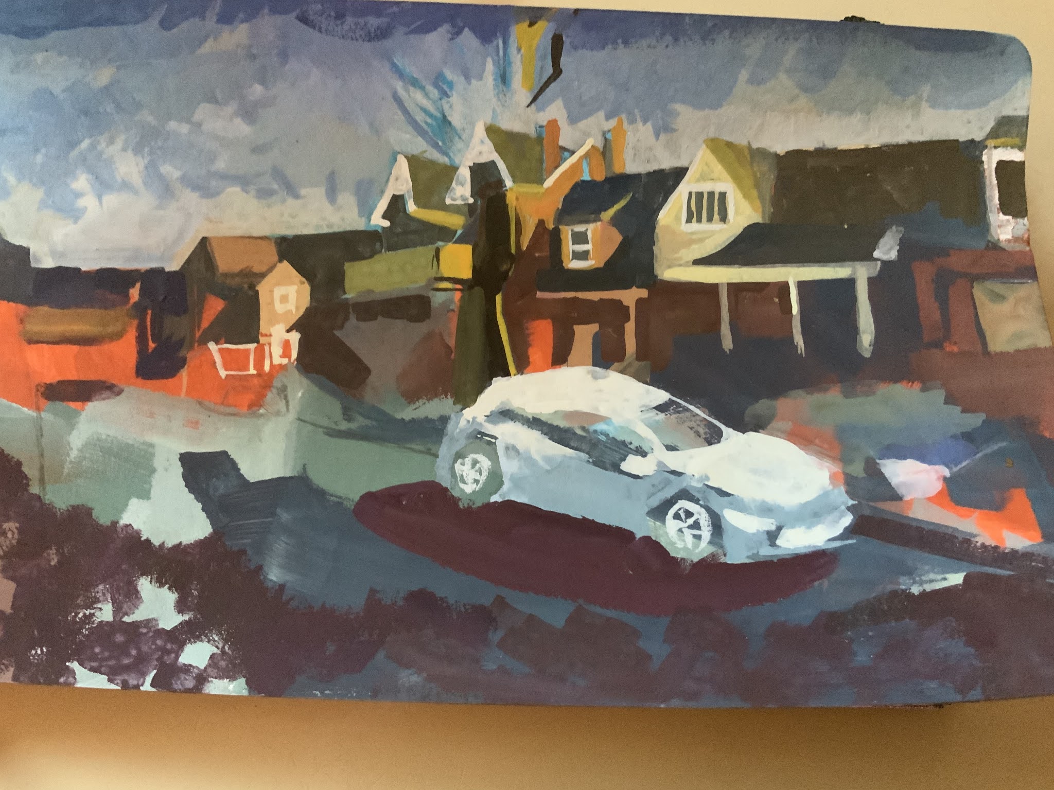
The photo is poor, really. Taken through the car windshield and wet snowfall at dusk, it has a certain atmospheric quality I want to mimic, somehow. The lights seem switched on to over-glow and the colours are grainy and warm.

Winter paintings I admire use soft neutral colour to get the low light areas. John Kasyn, for example, who often shows the unflattering back side of the house on an overcast day. A certain charm is there, in the airing of the dirty laundry and the daily mundane.
 |
| Preliminary Sketches |
 |
| First Washes |
 |
| Colour development |


Recently I was at Harbour front with urban sketchers (2 others) and was inspired by David Chen and his approach to watercolours. We talked about the struggle with overdrawing and the need for spontaneity. I’m looking for a method that will serve me and be enjoyable while I’m painting. I also like the urban watercolour landscapes by Alvaro Castagnet. Here is the start with light hues and washes on a card.


