Friday, October 10, 2025

Scale-Up? How much?


Often I hear people say I should work larger. This tiny 6x6  oil painting is intimate and inviting in my hallway.
Hanging in a small space it is intimate and inviting, so seeing it mocked up on a 40 inch scale is somewhat disconcerting.Does the subject still work?
Exhibited at Leslie Grove Gallery, it didn’t seem to receive the attention that the larger works did.


Monday, September 22, 2025

Finishing Touches


 This small grocery is a locus for locals- we wade through traffic to meet there. Getting there early in the morning shows off the warm buff coloured brick and the shadows on the awning. The small 6x6 inch seems to suit the subject- a tiny but bountiful and fresh selection, tucked into an inviting storefront display.

This little oil painting goes to Leslie Grove Gallery tomorrow for the Crossings show!

Tuesday, May 27, 2025

What a difference a sky makes

Praça Do Município, Ponta Delgada Azores, Before the Procession, Sao Miguel


The darker underside of these clouds somehow doesn’t look right. Perhaps the lower edge needs to be softened?


Thursday, October 10, 2024

Too many colours?

 I was very excited about this small painting when I finished ragging out the light values from the Prussian umber underpainting, The more it progressed however, the more it looked like the photo, with too much attention to local colour and a pointlessness in strategy. Originally, it was the light dark contrast, the secret invitation to the interior where all good things are.

Orange, green and purple dominate, so secondary triad would be my guess. Would it be better in a more narrow range?
Cooler greens and greys and a blue violet shadow, and reds changed to maroon


Nearly done- the awning needs a darker green at the crease, the sidewalk and figure will go in, and the power lines and shadows, and a highlight on the pole.
Perhaps the signs under the canopy could be more muted.

Friday, September 13, 2024

Queen Fresh Market

Sketching from a parking lot

 This perfect little grocery at the top of my street has super produce and other necessary ingredients, which inspires healthy appetites and good cooking. Morning light makes the sign and the oranges glow, so I screwed up my courage and went out to make a sketch. Using the photo I was able to isolate those wonderful blacks on the iPad. The underpainting will be cool- a mixture of burnt umber and Prussian blue, which will dry fast.

Cropped and sketched from photo

Amazing how three dimensional it is already, just wiping out underpainting!

A nice sketch, but the perspective on the awning needed correction.


Friday, August 30, 2024

Escape


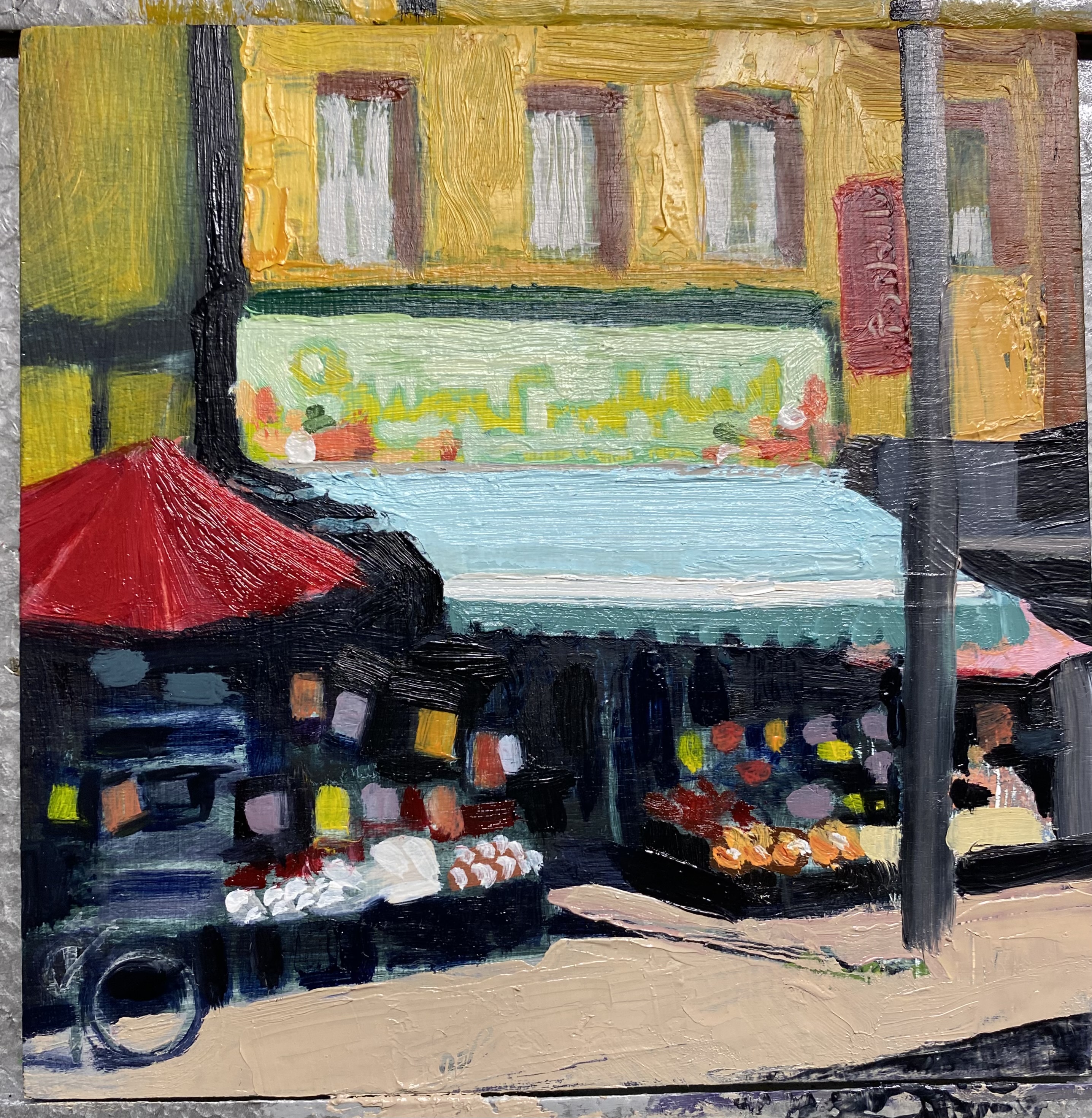
 After making decisions about cropping, distortion and a split compliment colour combo (can’t go wrong with that) actually painting the canvas came with surprisingly little apprehension. The usual self-doubts set in, like- “Will people relate well to this, or is it ___________ (amateur, ugly, pointless, overly eccentric or weird)?”, and “Can I handle all these straight edges, or is this getting really sloppy?” and, “This underpainting needs to be more orange and less pink!”. Too late to change that. 

Actually, the pure enjoyment of the painting and even the planning is worth more than any of that stuff. The 16x28 in canvas is not large by anyone’s standards, but it is for me, having done so many studies in the 4 in to 10 in range. I wonder if there should be more modelling or layering of colour. 

When a canvas is “fresh off the easel” as John Lynch said, it is too soon to make any appraisals. It will show in the West Toronto Artists Exhibition NORTH BY WEST in a gallery on Roncy in October - unusually quick for me - and once it is framed it will be better because paintings always look best framed.I feel like everybody paints and real feedback never happens. Then I wonder if it matters. Pure enjoyment matters, and forward motion in my work matters, whatever the degree of progress.


Monday, August 19, 2024

Glazing Elm Grove at Dusk


Orange Glaze
Blue Glaze
Purple Glaze
The first glaze is shown at right, so I ended with the lighter glaze. The medium mixture was 2 parts Gamsol, 1 part Liquin and 1 part Copal varnish. Small amounts were needed so I used take out hot sauce containers. The medium dries Matt, but there are areas of the paint that are glossy. I find this distracts from reading the colours so I will let it dry and do a coat of mat varnish later.
I think its giving some of the humid atmosphere I was hoping for.