Thursday, October 10, 2024

Too many colours?

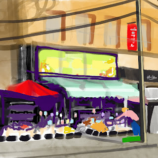
 I was very excited about this small painting when I finished ragging out the light values from the Prussian umber underpainting, The more it progressed however, the more it looked like the photo, with too much attention to local colour and a pointlessness in strategy. Originally, it was the light dark contrast, the secret invitation to the interior where all good things are.

Orange, green and purple dominate, so secondary triad would be my guess. Would it be better in a more narrow range?
Cooler greens and greys and a blue violet shadow, and reds changed to maroon


Nearly done- the awning needs a darker green at the crease, the sidewalk and figure will go in, and the power lines and shadows, and a highlight on the pole.
Perhaps the signs under the canopy could be more muted.

Friday, September 13, 2024

Queen Fresh Market

Sketching from a parking lot

 This perfect little grocery at the top of my street has super produce and other necessary ingredients, which inspires healthy appetites and good cooking. Morning light makes the sign and the oranges glow, so I screwed up my courage and went out to make a sketch. Using the photo I was able to isolate those wonderful blacks on the iPad. The underpainting will be cool- a mixture of burnt umber and Prussian blue, which will dry fast.

Cropped and sketched from photo

Amazing how three dimensional it is already, just wiping out underpainting!

A nice sketch, but the perspective on the awning needed correction.


Friday, August 30, 2024


 After making decisions about cropping, distortion and a split compliment colour combo (can’t go wrong with that) actually painting the canvas came with surprisingly little apprehension. The usual self-doubts set in, like- “Will people relate well to this, or is it ___________ (amateur, ugly, pointless, overly eccentric or weird)?”, and “Can I handle all these straight edges, or is this getting really sloppy?” and, “This underpainting needs to be more orange and less pink!”. Too late to change that. 

Actually, the pure enjoyment of the painting and even the planning is worth more than any of that stuff. The 16x28 in canvas is not large by anyone’s standards, but it is for me, having done so many studies in the 4 in to 10 in range. I wonder if there should be more modelling or layering of colour. 

When a canvas is “fresh off the easel” as John Lynch said, it is too soon to make any appraisals. It will show in the West Toronto Artists Exhibition NORTH BY WEST in a gallery on Roncy in October - unusually quick for me - and once it is framed it will be better because paintings always look best framed.I feel like everybody paints and real feedback never happens. Then I wonder if it matters. Pure enjoyment matters, and forward motion in my work matters, whatever the degree of progress.


Monday, August 19, 2024

Glazing Elm Grove at Dusk


Orange Glaze
Blue Glaze
Purple Glaze
The first glaze is shown at right, so I ended with the lighter glaze. The medium mixture was 2 parts Gamsol, 1 part Liquin and 1 part Copal varnish. Small amounts were needed so I used take out hot sauce containers. The medium dries Matt, but there are areas of the paint that are glossy. I find this distracts from reading the colours so I will let it dry and do a coat of mat varnish later.
I think its giving some of the humid atmosphere I was hoping for.

Sunday, July 28, 2024

Elm Grove at Dusk

 Working on panel in oils is something I have not done in quite awhile. I remember November 2022 was my last acrylic painting, so, two years! Lots of watercolour and gouache in the meantime though. I was trying to improve my drawing, speed and accuracy at urban sketchers, and composition by working out formula thumbnails in gouache, as preparation for something larger. It helps to make colour notes as I work with my palette, now in gouach, later in oil.  My confidence is eroding somehow, but I want to pursue at least two showings this year with West Toronto Artists. 

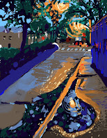
Walking with Joe recently after a rain a large puddle reflected the leaves and sky overhead, and the reich dark colours of a humid mid summer evening were awe inspiring. The sketch developed a “cruciform” composition (Ian Roberts, Mastering Composition) with warm highlights outlining the water. I’m experiencing difficulty translating my palette from gouach to oils, because my colour selections are limited in different hues. Cobalt in gouache, is Ultramarine Blue in oils. I will add to my oils another blue or two, perhaps.

Procreate mockups allow for no limits in colour choice, and help me to concentrate on large shapes, not distracting details.

After mixing in as much Liquin as possible while keeping a cream consistency, after four hours the oils are not even tacky yet! I may try this in acrylic also. 

Sunday, March 31, 2024

Friday, March 22, 2024

Better sketching with Marc Tarot Holmes!

This is a great book by Marc Taro Holmes!! I am developing a sketch protocol I call HICSLAS so I can capture more quickly.

Urban Sketching is frustrating me because I expect better results in less time and keep getting foiled. It feels like I’m slow to get started with a sense of overwhelm, and the final result could benefit from a tighter structure underneath but looser handling in ink and paint. That being said, this one was quite successful!


This started straight from ink with no sketch.

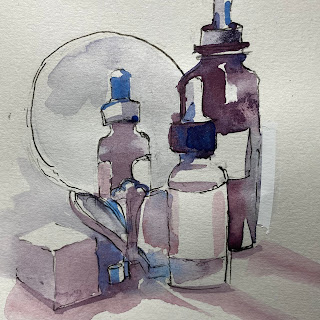
 It seems a little weird, but in the bathroom I realized instead of magazines I need a sketch pad! All the little bottles, and a ten minute break from other interactions, is tailor-made for sketchbook target practice. 


Third try much improved!

First Try- placement errors
'


HICS LAS - acronym means - 1. Horizon or eye-level  2. Interest. Where these intersect is like Thomas Schaller’s first two lines in any sketch.  3. Compare height width limits for page placement.  4.Silhouette, draw an envelope lightly outlining overall shape.  4. Large to small shapes in order of completion
5. Angle Check, where two points are chosen and the angle set between shows mistakes in proportion (THIS COULD BE THE MISSING PIECE OF THE PUZZLE FOR ME! I KNOW TO SIGHT ANGLES, BUT DIDN’T USE THEM FOR SPOT-CHECKING PROPORTION!!  6. Scribble, Shadow. The imprecision of the HB pencil scribble works well if the proportion and placement are


Sunday, March 3, 2024

Valentine Alley

The third version of this scene is painted with pinks and lilacs, so, mixtures of red and blue with white gouache. The light demands a sunny yellow however, so the compliment of purple is there too. The shapes are pretty much resolved now, but the background tree is omitted, to show off the leaning poles and power lines against a more complicated sky.

Monday, February 12, 2024

Painted Alley Cropped


Photo reference and casein underpainting


Same alley different composition, and another day. Another cropped edit of the same photo shows the person in the distance more plainly. This colour scheme veered away from the warm sunlit tones to a cooler yellow complimented by cold blue darks. I don’t like when my paintings become fussy. Maybe that’s why I’m working so small. If it all gets boiled down to abstract essentials like the distribution of value and temperature, the whole thing works together more. I’m attempting to indicate direction of brush stroke also, with an intention to work larger. When I photograph it and look at it later, seeing it differently, I hope to sort out what this is- abstraction, colourfield, illustration (oh,no! Not that!) romantic nostalgia, atmospheric realism, or just clumsy paint handling:)


Friday, February 2, 2024

Painted Alley

Cropping, Notan, Focal Point and Palette


 Recently I watched a short video by Mitchell Albala about creating Notan studies for landscapes, and it got me thinking, could that help me simplify overwhelming detail in sketching? Could it jumpstart a better composition for a painting? 

The iPad is a great tool for cropping a photo and layering a Notan in was doable. 

When drawing from the photo I was defining shapes of shadow and light- a better approach than defining edges as lines- (no wonder that gets overwhelming) and shapes are relatively easier to draw. Less tension around placement and proportion.

Gouache is a way to make colour decisions and make 5x7 inch thumbnail paintings. I see this painting much larger in oil or acrylic. Scale would make the end of the alley visible- as it is a focal point, after all.

Pictures of Japan

Anyone who appreciates minimalist architecture would enjoy Japanese Cities. My photos were sometimes just of streets scenes when some aspect caught my eye within the linear flow of the street and buildings. Harajuku- Takeshita Dori street is a popular Tokyo neighborhood that caters to a vibrant youth culture. The curved building is interesting. I think the second floor was for rent!

Harajuku Takeshita Dori


I seldom finish. Partly because I fall in love with it, but I don’t want it ruined, and partly because I’m already dissatisfied and as long as it’s in the drawing board I’ve got skin in the game! Not so wonderful is the accumulating graveyard of un-failed paintings in my studio.

Harajuku Takeshita Dori